Overview
UX Benchmarking by definition is the process of evaluating a product or service’s user experience by using metrics to gauge its relative performance against a meaningful standard.
This round of benchmarking would serve as a baseline to which new designs would be compared. As designs would be iterated upon the same study would run to evaluate how the new experience compared to the old experience.
Project Length: June-July 2021
Client: Bank of the West
Role: UX Researcher
Collaborators: Sarah Neuhring
Tools: UserZoom, Slack, Dropbox, Keynote
Context
Bank of the West's mobile banking app offers "Zelle", a service that allows customers to make and receive payments and the recipient of the payment does not need to have a Zelle account unlike services such as Venmo that require an account.
To begin benchmarking the entire mobile app I decided to benchmark the Zelle experience to begin the process as the next iteration was on the roadmap.
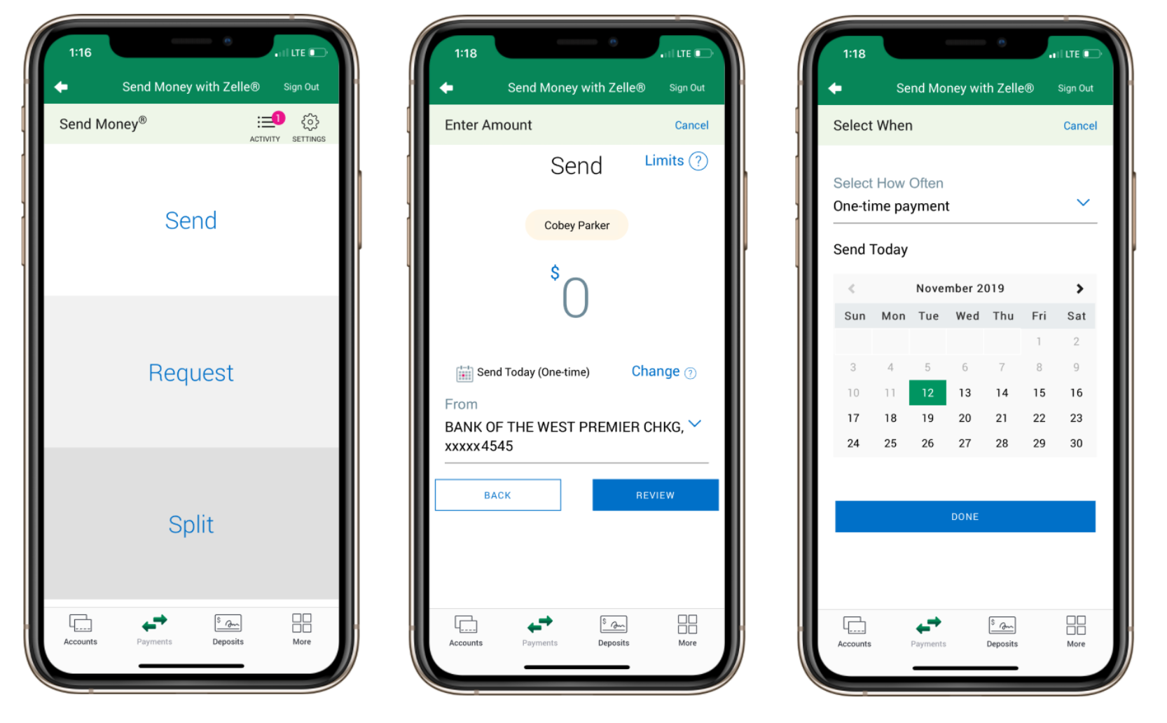
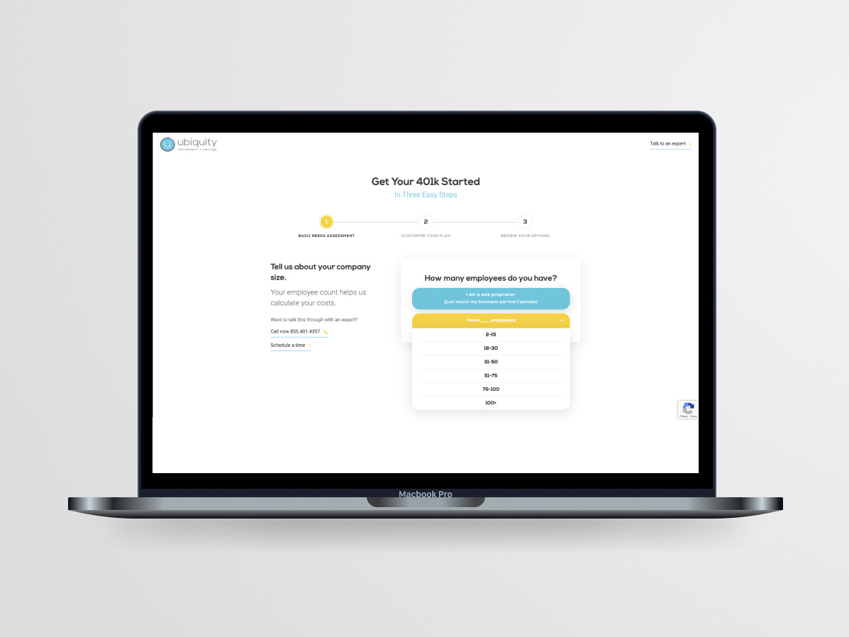
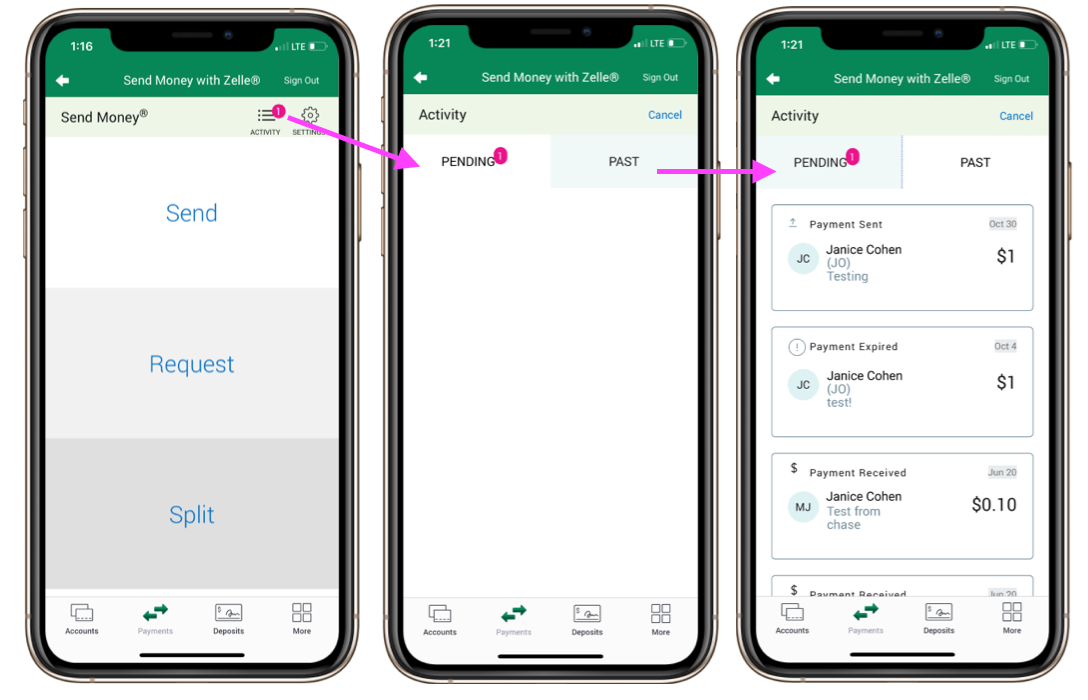
A few screens from Bank of the West's Zelle Send money flow.
Goal
Participants took part in this study so the research team could:
1. Get a baseline of the mobile app’s Zelle experience
2. Understand which tasks were the most challenging
3. Understand how participants perceived visual design
Methodology
Unmoderated usability study
- 235 participants completed the study without a researcher communicating with them
- Answered questions about their awareness and usage around Zelle
- Saw 3 randomized tasks out of 8 total tasks
- Rated the look and feel of the experience
Findings
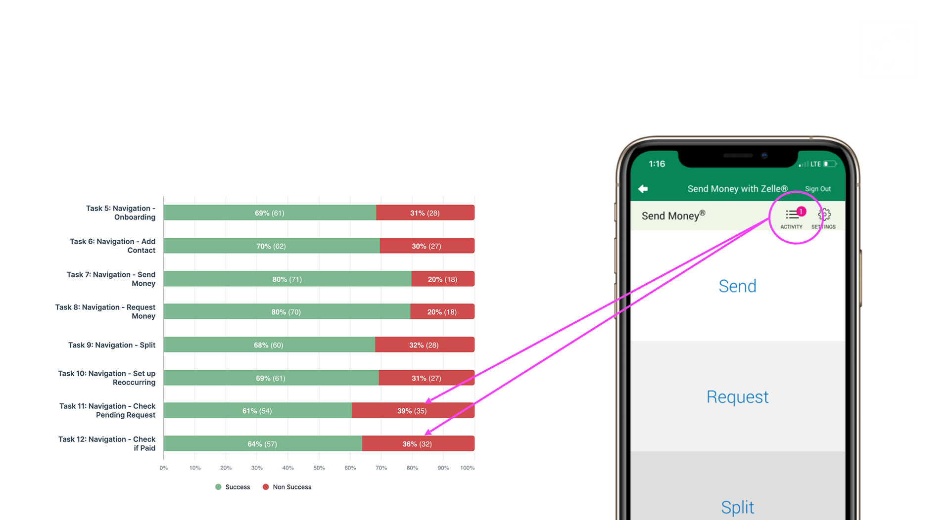
Most Challenging Task
Checking pending requests with a failure rate of 39% followed by checking if paid and Onboarding with a respective failure rate of 36% and 31%.
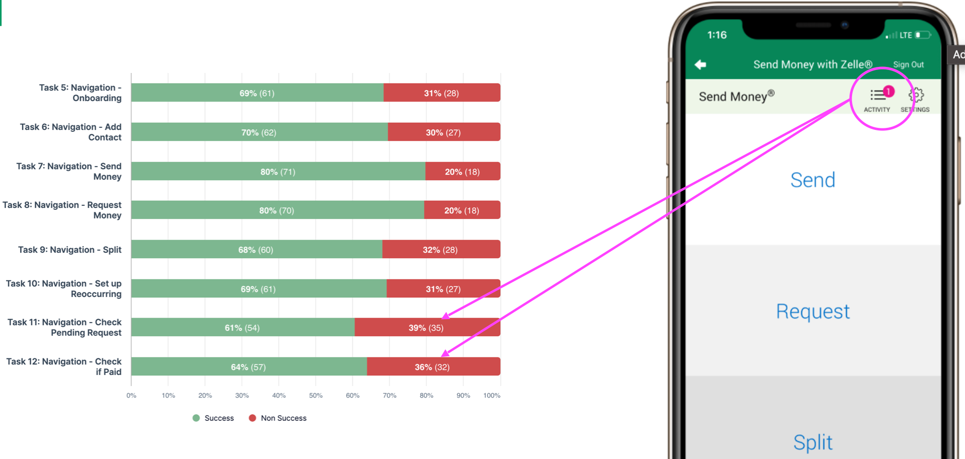
Highest Success Rate
Sending and Requesting money had a success rate of 80%. Indicating that navigating to and through the process of sending and requesting was easier than other tasks.
It's important to note that 20% of the participants were not able to complete this task.
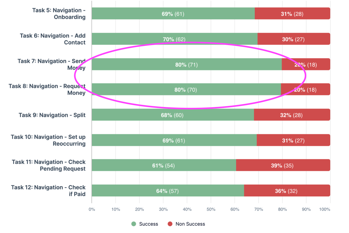
Capability Voted Most Important
Navigating to the “Past” screen to check if paid was rated the most important but the second to hardest task to complete based on our failure percentages.
Personal Learnings
The power of visuals in communication: I observed that presentations with strong visuals significantly increased audience engagement. This reinforced the importance of designing content that leverages visual learning, making information more accessible and memorable.