Overview
Cell-Ed, as a technology driven service, provides users with a solution to their time constraints by offering bite-size English, Spanish and even work environment skills through mobile devices and call-in services. During my internship I created Click-To-Buy an onboarding platform which gathers information in the form of a short survey and recommends the best package for the user's specific needs.
Project Length: June - September 2019
Client: Cell-Ed
Role: UX Design Intern
Collaborators: Sonali Joshi, Jessica Aalami-Rothenburg
Tools Used: Figma, Principle
Challenge
How might we use Cell-Ed's existing platform to encourage the online purchase of learning packages?
Secondary Research
After secondary research and multiple meetings with different teams within the company, I found that there are 3 different user groups to take into consideration during the design of this flow: Potential Partners, existing learners getting lost, and potential learners.
It was important to differentiate these groups early on in the design process so I could begin designing for the selected group as an MVP of the product for testing and resource reasons.
Additional insights from competitive research
- Opportunity to clarify the value proposition to better highlight what we offer
- Refresh the visual design to create a more modern, engaging experience
- Add transparent pricing to support decision-making
- Streamline content to surface the most relevant information first
- Improve navigation to help users find products of interest more easily
- Provide clear contact options or a help desk to enhance customer support
Persona:
For the MVP we decided to focus on potential partners as the user group as the majority of existing clients are partner organizations rather than individuals. Based on secondary research and interviewing existing clients I put together the following persona to design for.
Ideation
To address the problems of our users, we delved into brainstorming and ideation. We had a few five to ten minute brainstorming sessions to creatively think of solutions and then came together to synthesis ideas.
Some of our ideas:
- A short video which captures what Cell-Ed's mission is, what services they provide and a few testimonials from clients.
- A survey in 3 short steps to make sure it doesn't take too much time and effort for the user
- A helper bot which can assist the user in every step of the way incase the content is confusing
- Salesforce integration for easy account set up
Prototyping
Homepage
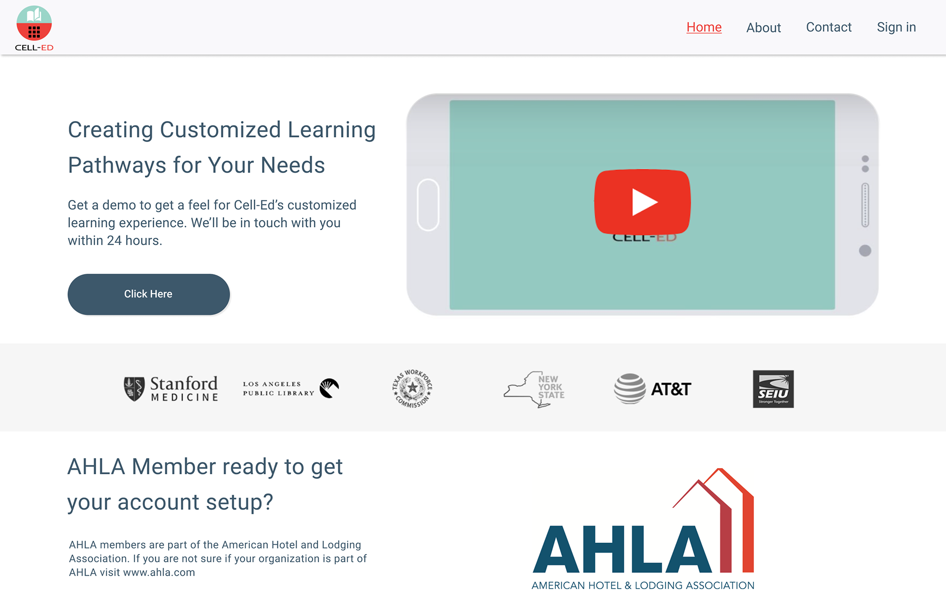
The new landing page welcomes users to Cell-Ed with a short video explaining what Cell-Ed does, the impact it has made on people’s lives and invites them to join.
This video has audio and subtitles in case the user is in a sound-free zone or would rather read. Below the video is the AHLA link prompting the user to set up their account which will take us to the questionnaire.
The visual circles which highlight Cell-Eds performance are designed to draw attention to our performance and give the website a modern look and feel.

Questionnaire design
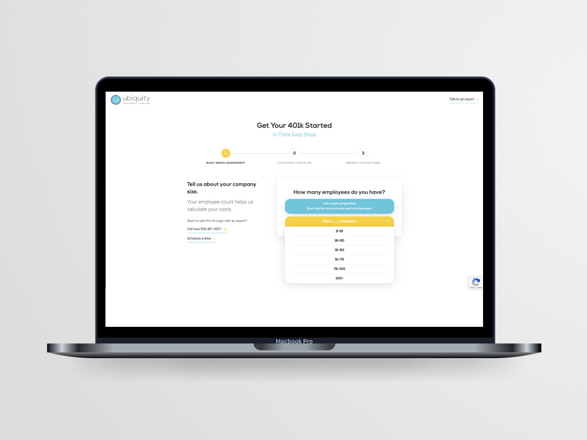
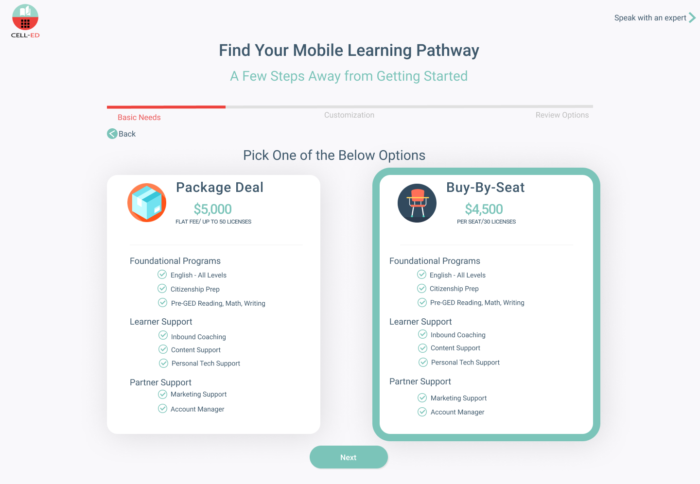
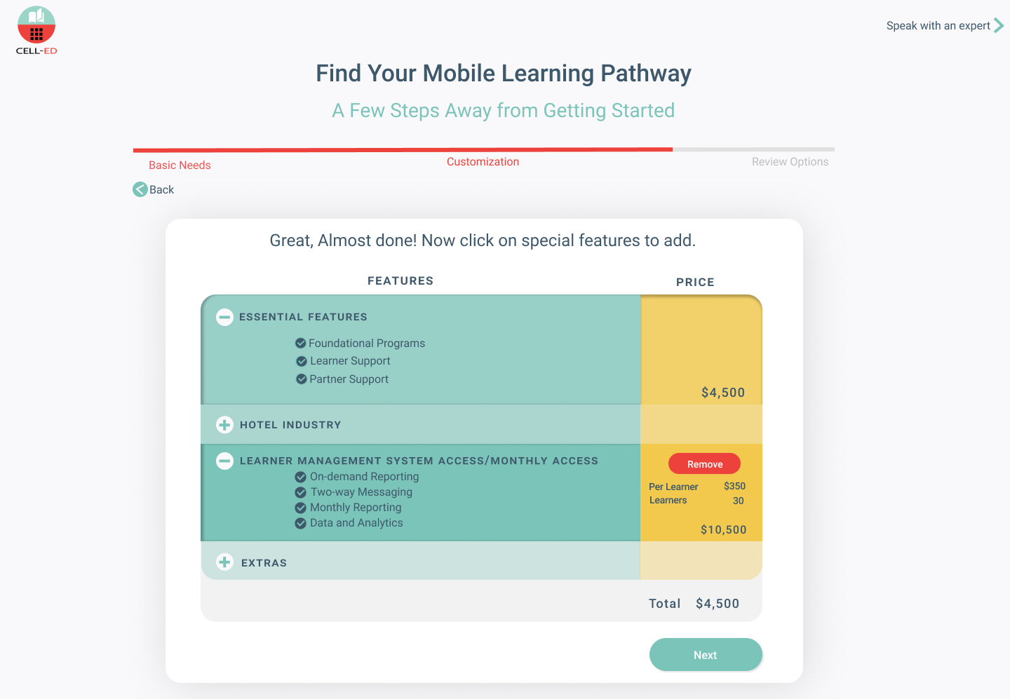
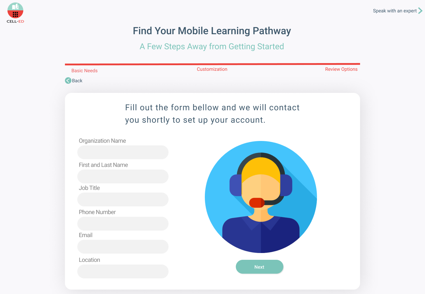
The questionnaire is short and fully guided, designed for users with limited time. It collects the number of people using the service to provide accurate feature cost estimates. Users can choose a package or a “buy by seat” option based on their needs, and the questionnaire ends by prompting contact information for account setup. Clear communication about what users can expect in return and when they’ll be contacted helps set expectations. Users can then choose to pay immediately or set up an invoice.

User Testing
Due to the timeframe + budgeting constraints, I was only able to test this flow on 3 of my coworkers. From past experiences I learn that Low-Fi prototyping and testing goes a long way and therefore had meetings with different teams to gather feedback on the Low-Fi prototype before the last round of testing.
I asked my coworkers to access the prototype and share their screens when going through the process remotely. As a result, I gained some experience with moderated testing, an important skill in the remote work life we are in today due to the COVID Pandemic.
Feedback Received
The progress bar helped users see the survey’s endpoint
Some users were hesitant to provide credit card information for a large purchase
The meaning of the 84% statistic was unclear

