Overview
Bank of the West has partnered up with 1% for the Planet recently offering a debit card that comes with a Carbon footprint tracker. This debit card is the first of its kind, it tracks your carbon footprint based on your purchases; the main reason I was drawn to this opportunity.
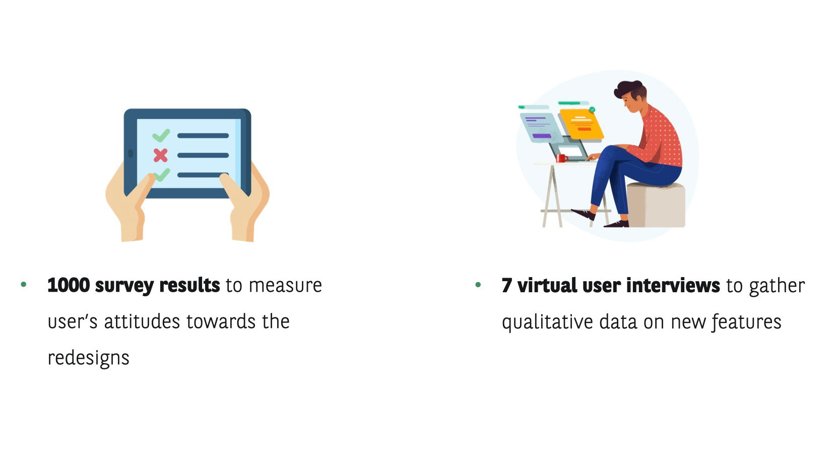
During my internship, I redesigned the existing carbon footprint calculator within the mobile application, designed a survey that was sent out to 1000 participants, and interviewed 7 users.
Project Length: June - August 2020
Client: Bank of the West
Role: UX Research Intern
Collaborators: Tim Silva, Sarah Neuhring, Jeff Beaulieu
Tools: Sketch, UserZoom, Slack, Dropbox, Mechanical Turk, Keynote
Context
Bank of the West BNP Paribas, announced it is the first U.S. bank to enable its customers to track and measure the CO2 impact of their purchases in December 2019.
Bank of the West now provides a digital, on demand view of customer's CO2 impact of their purchases. This app is in line with BNP Paribas' strategy to accelerate energy transition of its clients and with the Group's existing targets for the financing of renewable energies in order to foster their development.
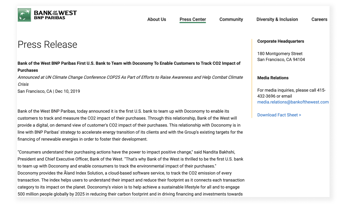
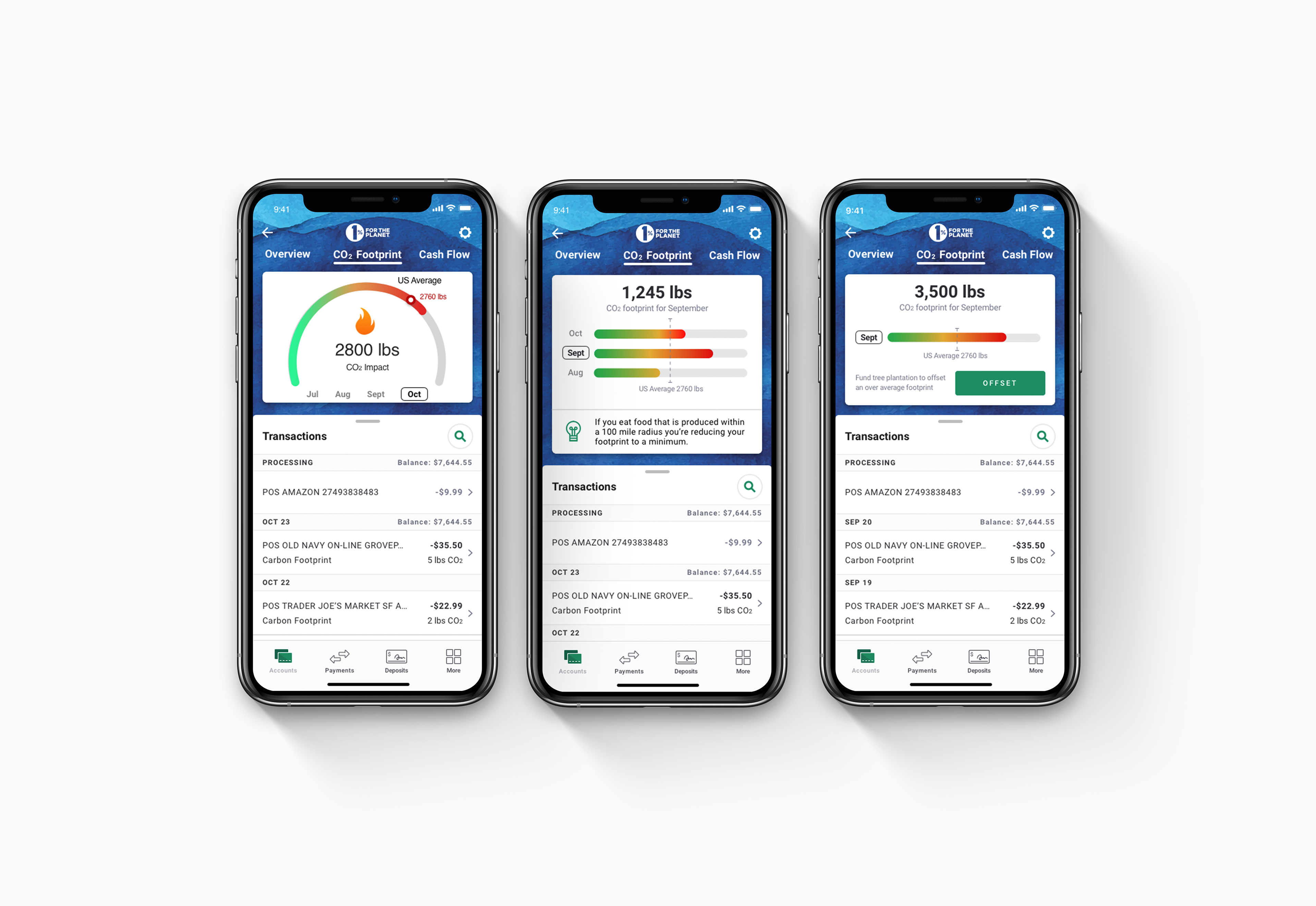
Screenshot of Bank of the West's press release announcing their new initiative
Challenge
How can we trigger behavioral change in our users in favor of a greener lifestyle?
The Solution
The original app plus a little extra! This carbon footprint tracker helps not only understand the user's total carbon consumption during that month but also includes these additional features.
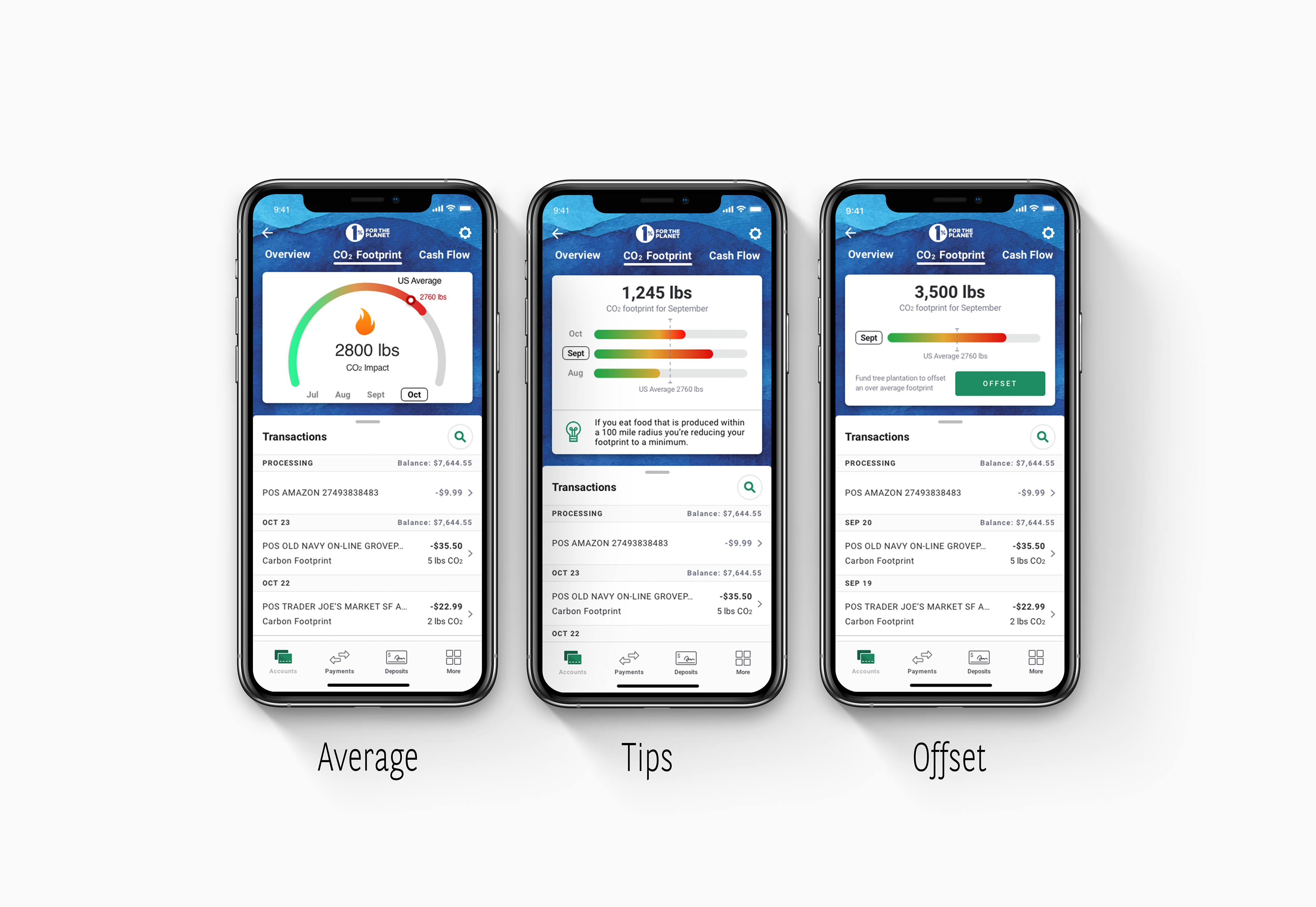
1. Average: The line drawn in the middle of the graph indicates the average carbon footprint consumption in the user's country. Personal carbon footprints are a new concept to most users at this moment in time so this average helps bring meaning to a number.
2. Tips: The section seen on the lower portion of the card offers tips that periodically change every time the user logs in to the app. These tips help educate the user on what they could be doing differently to decease their carbon footprint.
My Responsibilities
For the duration of this internship, I was responsible for research planning, redesigning, and task flow stages of the project. I was also in charge of designing the wireframes, creating prototypes and conducting usability testing for carbon footprint app experience.
I also designed a survey with the help of my manager, the VP of research, and UX Research coworker which is a SME on survey design.
Secondary Research
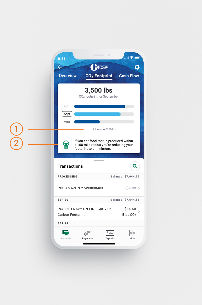
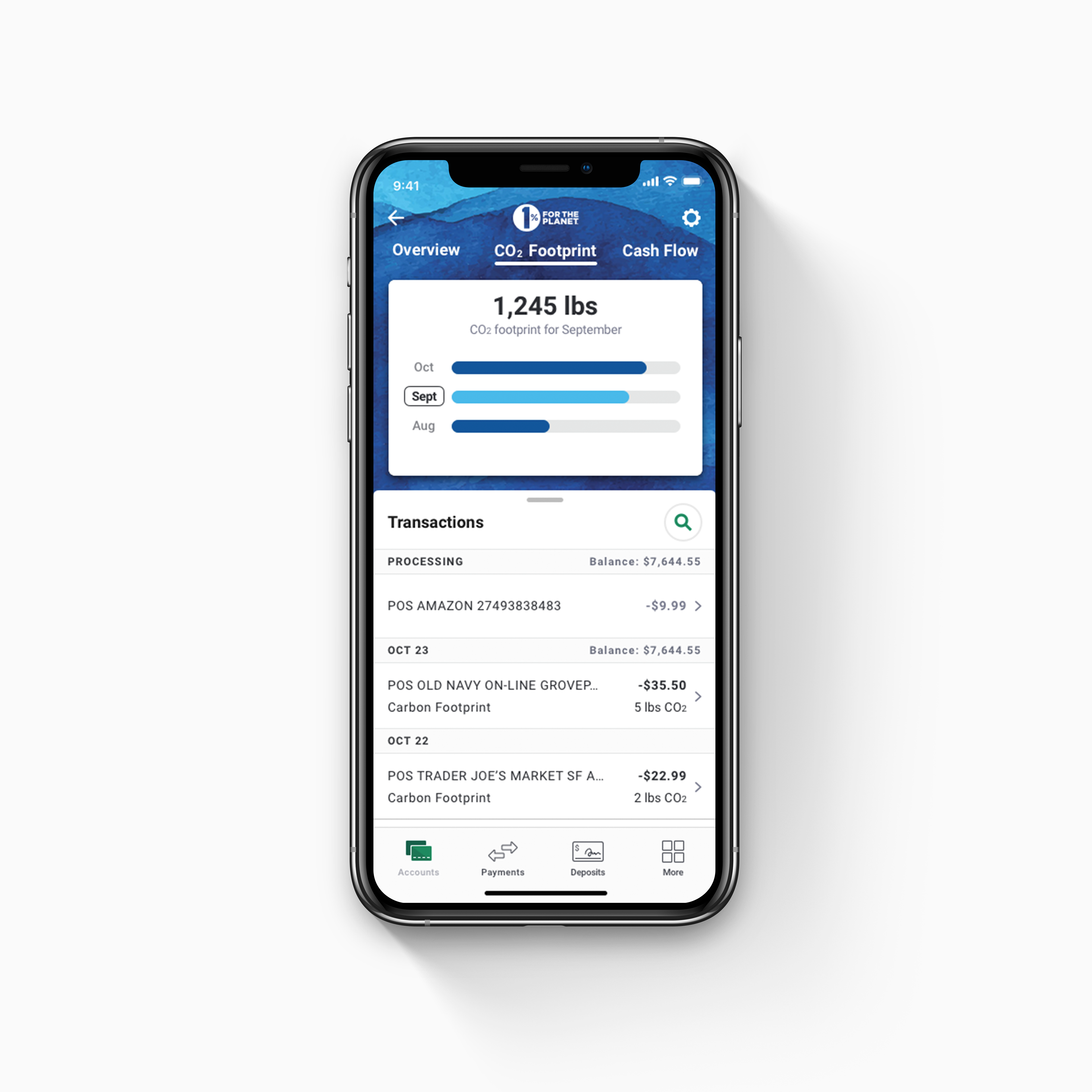
In order to gain some understanding on the current feature which you can see in the image below, I spoke with the sr. researcher on my team. She advised me to watch some user interviews she conducted a month prior on this version.
I watched all the footage and synthesized the findings into the bullet points below.
This research was EXTREMELY important for me at this point as it helped me gain a better understanding on what issues the user had with the feature, what confuses them, what they liked to see etc.
- Confused about the number being displayed.
"Is 1,245 lbs a good number or a bad number?"
- User was expecting more information about how to be more green.
"If this is a high carbon footprint, how can I do better?"
- Liked the breakdown of carbon impact for each transaction
"The breakdown helps me understand which of my purchases are bringing my number higher"
Connecting the User's Needs to the Organization's Vision
After understanding that most users do not have a high knowledge base around climate change I realized the Bank of the West Carbon Footprint tracking feature is confusing and difficult for them to interpret because it requires them to know how many pounds of carbon emissions is good and what is excessive so I started curating my research question to help focus my research and help me redesign the app.
I also wanted to understand what leadership envisioned the future of this app. This involved getting to know the stakeholders and understanding what their ultimate vision for this service was. The main vision all stakeholders shared was the app helping educate the user on climate change and their impact on it.
These meetings were held throughout the research planning process and helped me arrive at this research question:
Research Question
How can we bring awareness to users of their Carbon footprint and motivate them to change their behavior?
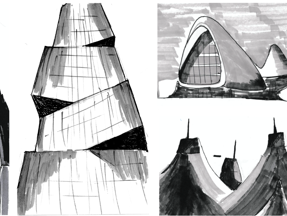
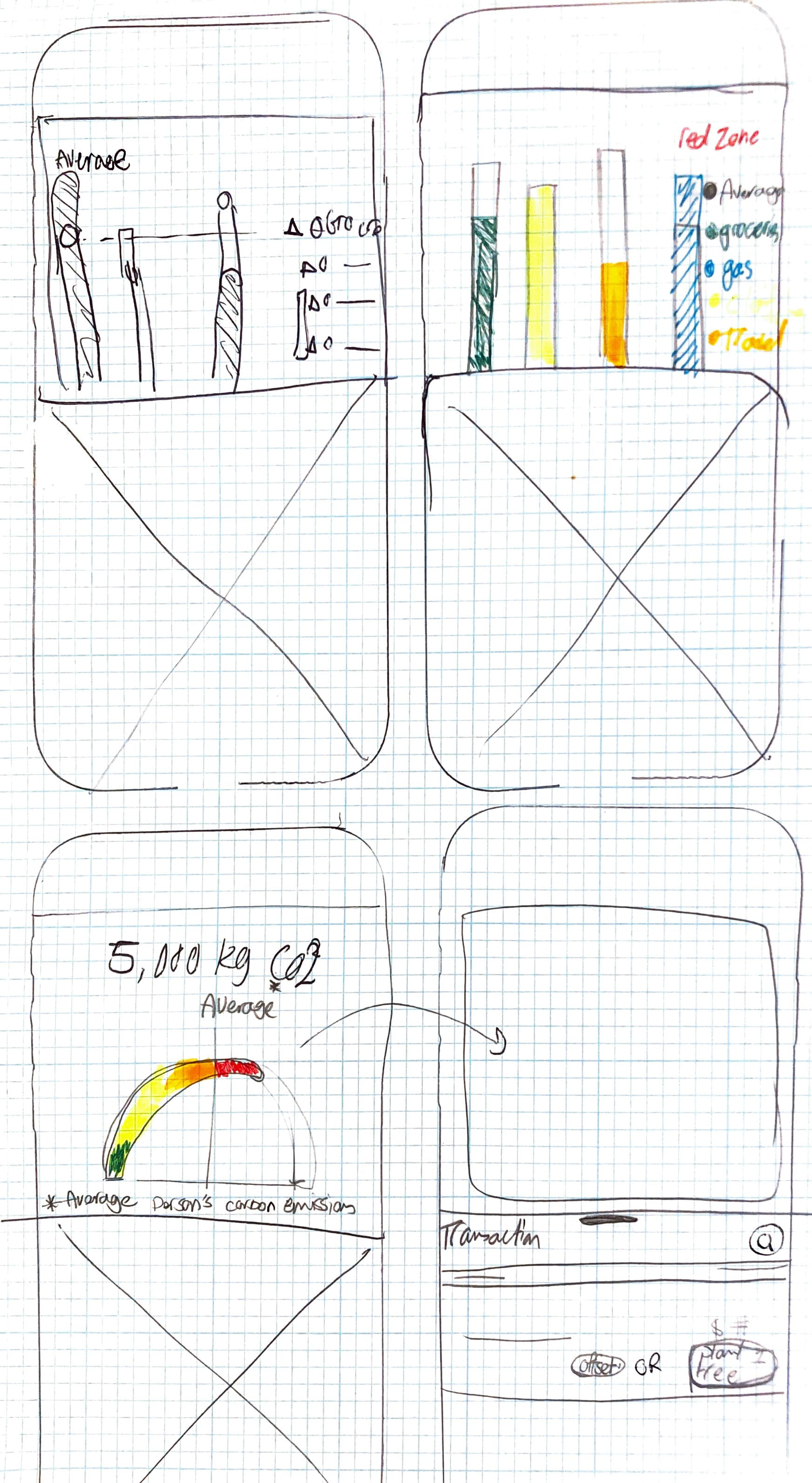
Sketches
Now that I knew what the pain points were, I knew what the vision for the application was (ultimately changing the behavior of the user to live a greener lifestyle), I had gained a better understanding of what improvements were needed so I drafted quick sketches of some of the ideas I had.
I shared these sketches with the stakeholders and research team. They told me they will be wanting a realistic plan for simple fixes which they can implement in the rollout and then more improvements for the next quarters. So I went ahead and decided on 3 potential iterations and designed them using sketch.
I decided on 3 ideas so one of them could be done immediately and the other 2 would be chosen based on how much potential it would have to change the user's behavior.
Redesign
Average
To address the needs of the user wanting to know if the number they are seeing is "good or bad" I designed an average feature. This helps the user know where they stand with respect to other Americans. I also changed the color scheme to reflect how well the user is doing in that particular month. If over the national average, the dial will turn red indicating they are not doing very well. This is designed to evoke a sense of urgency and to eventually change the behavior of the user.
Tips
The user mentioned that they don't have enough knowledge about the subject matter to be able to change their behavior and would like to know more so this "tips" section changes every time the user logs into the app giving them different factoids about what they can do to bring down their numbers. This feature both educates and gives the user a way in which they can improve their behavior.
Offset
This feature helps users which cannot alter some behaviors such as air travel or gas for commuting to offset their carbon consumption by donating to organization which fight climate change by planting trees etc.
Research Methods
I decided on 2 different methods because I wanted to challenge myself to learn more about Survey Design. I had utilized surveys in the past but I was aware there was much to learn about questionnaire ordering, mass distribution and potential biasing that I was curious to learn about.
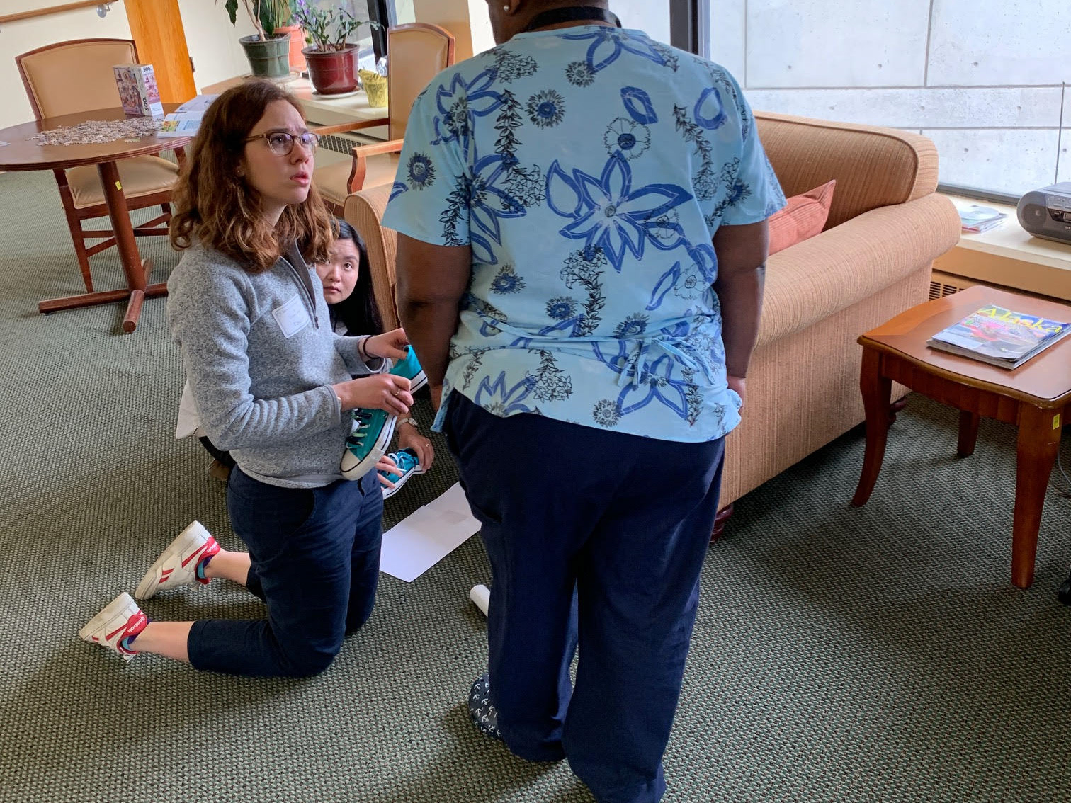
Because I was redesigning the Carbon Footprint Tracker and had 3 potential solutions I knew I needed to put them in front of the users to get the qualitative, rich feedback. This feedback would help me understand which features are the most important to the user, what excited them and what confused them. So I set out to conduct 8 moderated UserZoom interviews but was not able to reschedule the last one.
Survey Design
I had 8 conditions which were combinations of the 3 prototypes in addition to the original design. I was trying to find out if there is a difference in knowledge level etc. before and after seeing the prototype and whether there is a difference between each prototype.

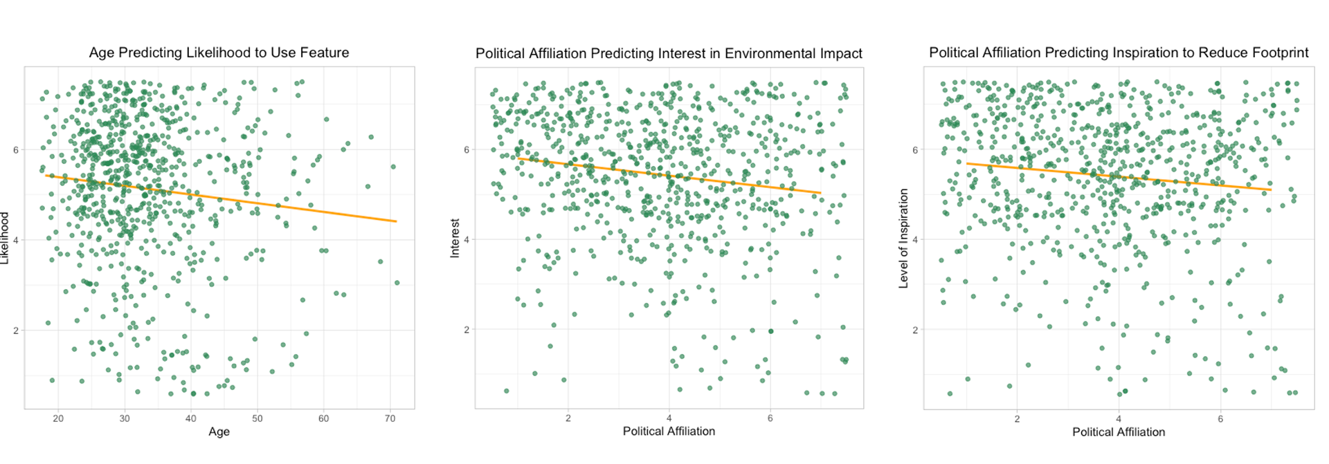
Survey Results
The pre-test/post-test survey results did not return significant results but some of the demographic data returned potentially valuable findings for the marketing team. Including:
- The likelihood of usage of the app based on their age group
- The Interest level on carbon footprint tracking based on their political affiliation
- Level of inspiration to reduce carbon footprint based on their political affiliation
User Interviews
I had the pleasure to speak with and share the redesigns with these7 individuals. I showed every participant 2 prototypes. I set out to interview 8 because I wanted each prototype to be viewed twice as the first prototype seen to eliminate any bias that may exist from seeing a prior prototype.
There was so much great information to organize and sort through that I decided to use affinity mapping to synthesize all the valuable feedback from these great participants.

Affinity Mapping
After conducting interviews on UserZoom, I synthesized the qualitative feedback through affinity mapping and shared the results as actionable recommendations. These guided the team in preparing for the new application release as well as future testing and ideation. Among the features, the average function emerged as the top priority, taking precedence over the other two.
Ranked Features Based on Urgency of Need

Personal Learning
The value of great teammates: Enjoying the company of coworkers is key to staying motivated and finding joy in the work. I was lucky to collaborate with a team that was both highly knowledgeable and genuinely enjoyable to connect with, whether in meetings or casual conversations in between.
Surveys are deceptively complex: Running surveys taught me that results don’t always align with expectations. The findings I received were unexpected and interesting, even if they weren’t exactly what I had hoped for.
Designing better survey conditions: Next time, I’ll structure surveys with more distinct test conditions to highlight clearer differences between responses and uncover stronger insights.